
Touro University Portal
Helping Touro students and administration find the information they need with ease.


Role:
-
Product Researcher-User and Market Research
-
Product Designer
Deliverables:
-
High-fidelity prototypes: desktop and mobile.
-
Product Guidelines for the Touro IT team.
Goal:
Redesign the Touro Portal to guide Touro students to information more successfully.
Background:
As a student at Touro University I am a frequent user of the Touro portal and throughout my semesters I couldn't help but notice the difficulties I had while navigating it. As an honors student, during my senior year I was required to create a Thesis project with the Dean of students of Touro LCW as my mentor.
I saw this as my opportunity to fix problems in the Touro student portal and encourage UX consideration at Touro University.
My Understanding of the Problem:
At this point the background behind the creation of the student portal was unclear, but it was inferred that it was created with a certain degree of intention.
The Touro Portal at the start of this project:

Preliminary Survey:
I began by collecting information via a preliminary survey to gauge interest in the improvement of the UX of the Touro portal.
The following questions were sent out to Touro students at one division of Touro:
-
Is there anything about the Touro portal that you think could be improved?
-
If you answered YES to the question above, what would you like to see improved?
-
What was most confusing to you as a new student at Touro?
13 responses were received. All those who took the survey agreed that the Touro portal could improve.
At this point, I discovered that I had miscategorized the portal user base.
Initially, I assumed that faculty and students were the primary users. Still, during my discussions with these groups, I ascertained that while faculty does use the portal occasionally, their central platform is Canvas. The Touro portal's main user base is students and administration.
This was a good start; however, the specific issues that plagued students and the administration had yet to be pinpointed.
User Interviews:
A sample of the demographic was individually interviewed:
2 members of the Touro administration and 4 undergraduate students were consulted for a better understanding of pain points within the Touro Portal.
Topics discussed with Touro administration participants:
-
Which elements of the portal seem to annoy students in your interactions with them?
-
Which elements of the portal are most challenging for you?
-
In general, is helping students through registration a smooth process?
-
What questions are you most frequently asked?
Topics discussed with Touro student participants:
-
What annoys you about the Touro portal most on a day-to-day or semester-to-semester basis?
-
How often do you need to reach out to the administration regarding difficulty navigating the portal?
-
Are you able to register on your own (and follow all the steps correctly) or do you need to receive administration help? Do you find registration on the portal difficult?
-
Would you find it easier if your most accessed elements of the portal were easier to access? And what do you access most?
Below are affinity maps of the results of the preliminary user interviews:
.png)

In general, throughout the user interview process, there was a lot of frustration over the difficulty of being unable to perform seemingly simple tasks on the Touro Portal. The administration was frustrated that students couldn't accomplish simple tasks, and students were frustrated for the same reason however they did not know how to fix said issue.
The main takeaways from the user interviews were used to create user personas.
User Personas:
After conducting user interviews and mapping out the pain points students and administration have with the portal, two personas were created to represent the major pain points.
These personas served as great visual aids when presenting my research to those unfamiliar with the concepts of UX Research and Design.


Key Issues:
The main usability issues found with Touro’s portal design are illustrated with the annotated screenshots below:
1. Repetitive Copy:
From this segment of the portal alone, it is apparent how repetitive the copy of the portal tends to be. The extraneous copy makes it take longer for users to find what they’re looking for.

2. Inefficient Organization:
The widgets on the portal home screen are not organized by the most frequently used, an inefficient use of space.

Consulting with Touro's IT Team:
All findings thus far were presented to Renate Laine, Deputy CIO for Instructional IT at Touro.
At the presentation, two important points were disclosed:
-
Touro’s portal was made from a prebuilt template. This information explains many of the design decisions, in that they weren’t necessarily conscious decisions.
-
Touro University is currently considering a portal application change. Due to this, the redesign need not adhere to the current structure of the portal, and my work has a higher chance of being impactful.
At this meeting, I was invited to a demonstration of an application that Touro is considering hosting its portal on:
At the demonstration, I was shown a multitude of features that are possible to employ in a student portal.
-
A helpful feature that was shown was: Search bar feature.
-
An excessive feature that was shown was: the option to host a forum straight on the portal. It’s unnecessary because most students currently use WhatsApp and especially because Canvas has a discussion board option that many professors already employ.
If the university is using a template what value will mocking up a design hold?
-
It will be valuable in addressing what is important in a template
-
It will highlight what students access most (the UX) and how Touro should utilize the template.
Low-Fidelity Wireframe:
Below is a basic blueprint of what the redesign will look like on desktop.
Note the search bar feature and the decision to keep the side navigation similar its current state as four tabs. A minimal amount of navigation links minimizes confusion and helps those access what they are looking for promptly.
A system of simple icons and singular titles will be implemented (vs the current repetitive copy) to remove any confusion.
*The most accessed features of the portal had not been researched yet, therefore the portal features in the low-fidelity mockup are in no particular order.

Usability Survey:
Before creating the high-fidelity prototype I conducted a survey throughout various divisions of Touro to determine the most accessed features of the Touro portal.
Survey recipients were asked to rate each current feature from 1-10 (1 being the least used and 10 being used most frequently).
17 responses were received; these results were used to inform the high-fidelity prototype. One of the core objectives is to ensure that features that student access most can be found easiest.

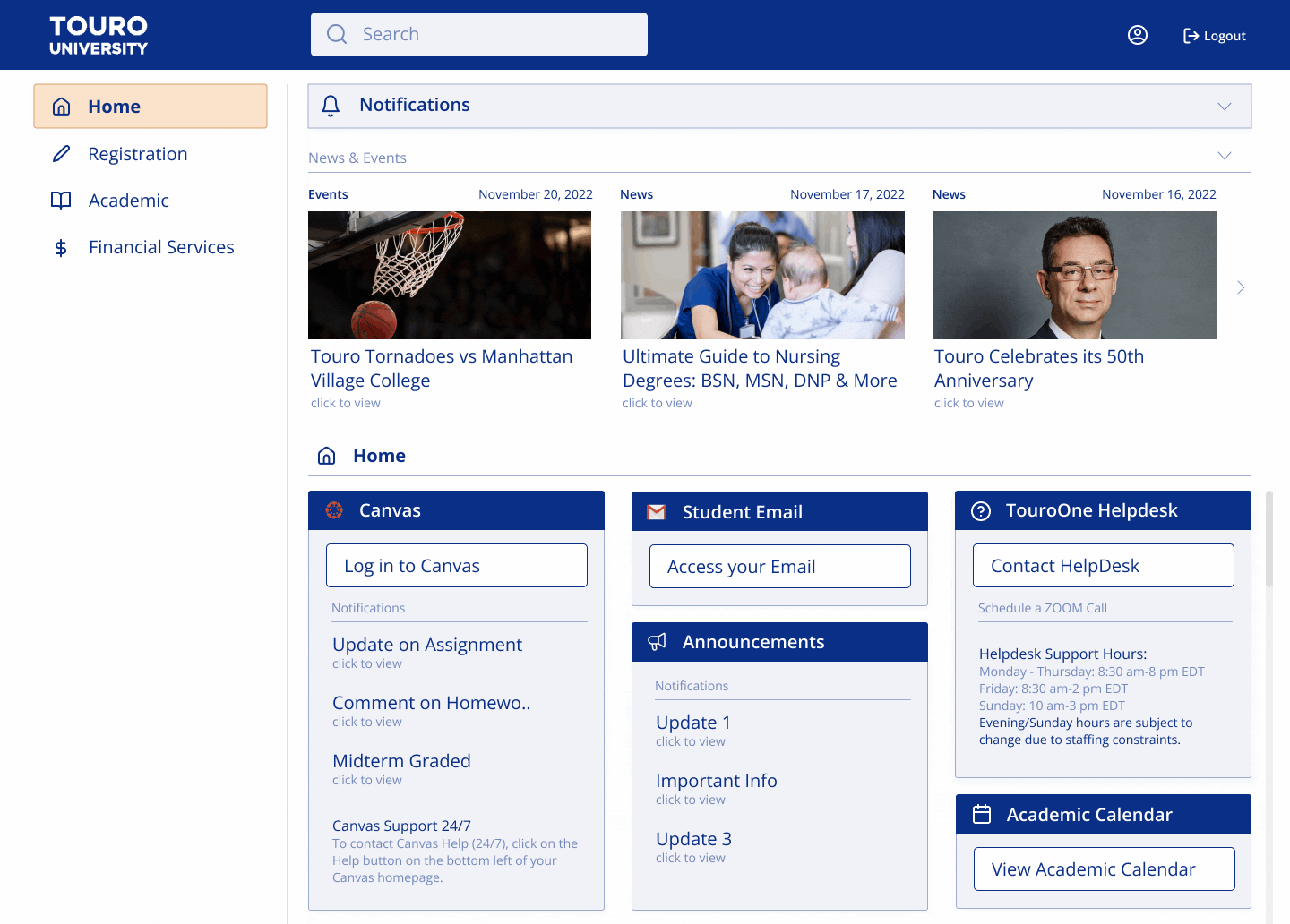
High-Fidelity Mockup:
Below is the first iteration of the high fidelity mockup. This was pre-survey, which is why the homepage was not fully designed.

High-fidelity mockup version 2:

High-fidelity mockup version 3:

Usability Survey:
Once the design had largely been built, a survey was conducted to finalize design choices and gather further data regarding user preferences.
Participants were asked to choose 1 of three 3 variations and include the reasoning for their selection.
There were 54 participants in this survey. Option 1 received 26 votes, option 2 received 28, and option 3 was selected by 3 participants (options displayed below).

-
The overall reason participants gave for choosing option 1 is because it is the most minimal of the three options, many participants found the news and events carousel (in options 2 and 3) distracting.
-
Those who chose option 2 preferred the contrast that the pale blue background between each widget provided as well as appreciated the news and events carousel feature.
After the survey results were received a design was created using information received from the survey.
The final iteration of the Touro Portal’s homepage includes a news and events section that can be expanded or collapsed, giving users the option to view current Touro news and upcoming Touro events if they are interested or hide them away if they are found to be distracting.
Design Guidelines:
The final step after finalizing the high-fidelity mockup was to create a set of general guidelines for the Touro IT team when updating the portal.
The goal of the design guidelines is to present all of the research done cohesively and coherently which will encourage the importance of emphasis on user needs.
Scroll through the Design Guidelines 👇


Implementation
The goal of this project has been to research user needs and create a design to reflect them, knowing that Touro will be using a template and therefore the design will not be replicated exactly.
However, Touro IT currently has these Guidelines and they will be influencing their decisions. Following this project, I will continue advising Touro IT in creating a new portal that better reflects users’ needs. The new Touro portal is projected to be in use before June 2024.